

WHAT'S THE POWER, POINT?
How I Learned To Start Loving PowerPoint

Happy Monday War & Peaceniks. Let’s make some PowerPoint!

I was taking stock recently and it occurred to me that I spend more time with PowerPoint than I do with any human other than my spouse. There are months that PowerPoint gets more attention (sorry Jill). I devote more time to making PowerPoint than I do eating, talking on the phone, or managing people on my team. (Sorry, Team).
The Media Universe Map you likely know me for first is, in fact, one PowerPoint slide. This is the latest.

I spent three hours this weekend updating this slide. In PowerPoint. I do that twice a month. at least six hours. Every month. Additionally, this weekend I created a presentation for a keynote in Denver later this week… in PowerPoint. I prepped the materials you will see in this newsletter post… in PowerPoint.
This week, you will likely read and/or write something in PowerPoint – something important.
As PowerPoint pioneer Russell Davies writes “all human knowledge is now stored in PowerPoint.” Certainly, a lot of my career – the good and the bad – is stockpiled in presentations I’ve made, on slides I’ve designed, to make points that were of the utmost importance to me at the time, but are meaningless now.
My Media Cartographer moniker is derived entirely from my PowerPoint prowess. The Map is just one slide. Albeit a complicated one…
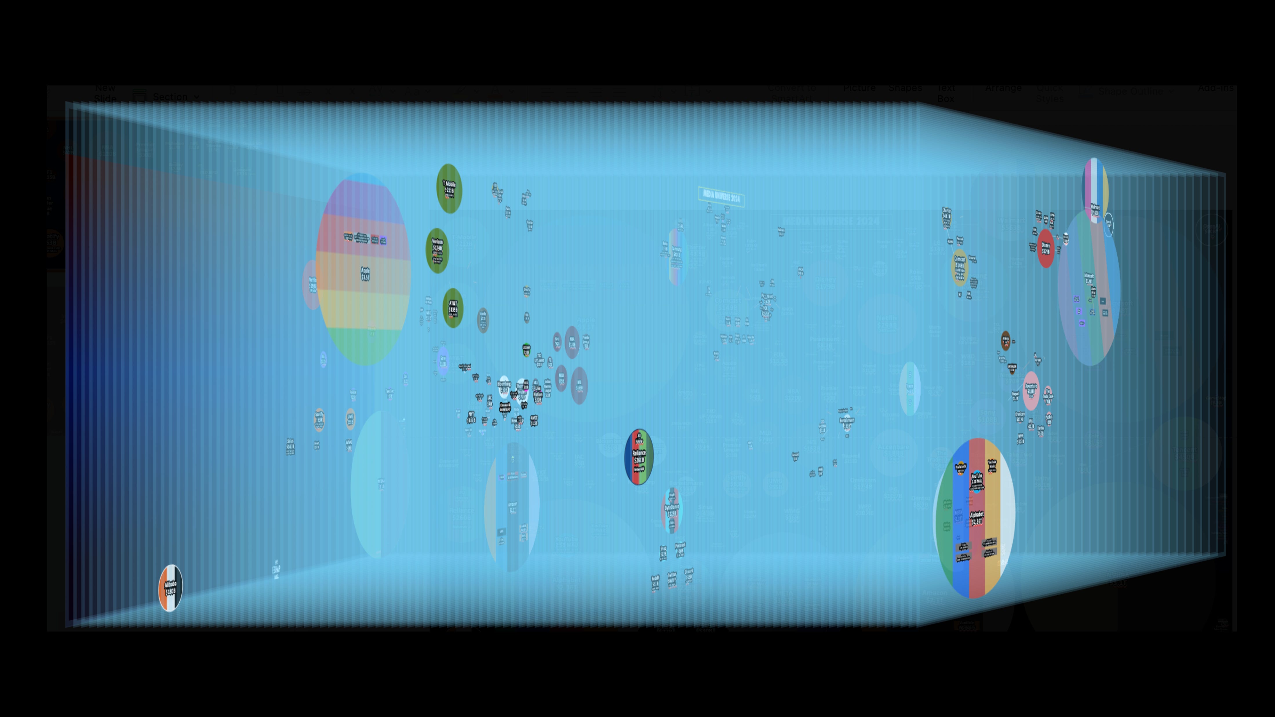
The slide on which I build the map has 205 layers and objects. There are twelve font sizes and four typefaces. There are 124 circles representing 124 companies. The objects are sized, to scale, by their market valuation based on publicly available information or data. Every month, I enter values of the companies into an excel spreadsheet, which uses a formula I had to ask a mathematician for, to generate new sizes for each planet based on their valuations that I then adjust (values and size) by hand in PowerPoint, along with other datapoints like subscribers, households, market shares, etc.

The Map is the foundation of my personal and company brand. It’s the first slide in every presentation I give, and I give a lot of presentations. It’s been adopted by many in our community as a semi-unofficial dashboard for the industry.
And it’s literally just a PowerPoint slide.
Recently I realized, in addition to being a bit of a Media nerd touchstone, this Map offers larger lessons that I learned from conquering PowerPoint, which are not about the Media, but rather about life. Despite my obsessive use of PowerPoint, I’ve never written about them before.
Some context…

Fifteen years ago, I was fortunate to moderate a panel at SXSW that featured Jaron Lanier, inventor of the concept and term virtual reality, creator of our earliest digital avatars, and author of one of the most important anti-big tech manifestos of all time, You Are Not a Gadget. On the panel, in the book, and out in the world, Lanier focuses on the “ambient manipulation in everything digital.” Despite being one of the founding minds of the internet, he talks about how big tech uses convenient, elegant, and often free services to slide us into automatic lock-ins that conform our digital selves into their natural oligopoly.
Jaron uses the example of the MIDI: “a piece of tech invented in the early 80s, for electronically expressing musical notes. Very quickly this development became incredibly popular and was used to create the sound interfaces in a wide range of computers and electronic musical instruments. But as technology moved on and people tried to update the MIDI system, they ran into a major problem. MIDI’s initial popularity meant it had been included in so many technologies that modifying it would require changing the way all those technologies worked – including the music systems used in computers across the world. In other words, MIDI had become locked in – so enduringly so, in fact, that we still use it today!”

In talking to and reading Lanier, I realized how many and how rigidly digital lock-ins framed my life – Facebook, Twitter, Word, Excel, LinkedIn! After reading his book, I could not look at those digital tools without seeing the lock-ins - the sameness they forced on me, the low expectations of collective uniformity woven into the canvas of each platform and program I used.
Nothing personified this more than PowerPoint.
Open the program and you are automatically dropped into THE template. Hit the slide “Layout” button and you are given an array of nine other templates to choose from, include “Blank.” There are other templatized design choices throughout the software. But the choices are false, and the word “design” is so inappropriately used, it should qualify as dirty. Try changing the Master Slide formats and settings, I dare you. You’ll email me in tears.
I had used PowerPoint decades before meeting Jaron. I started using it early in its lifecycle. I had prided myself on being best in class at it – using the presentation software in ways few had imagined. But after reading Gadget, I strove to do more than just use the digital tools well, from that day on, I set out to break those digital lock-ins wherever found them and bend them to my will. (Insert maniacal laugh here.)

Recently, John McCarthy, CMO of Kantar Media sent me the book Everything I Know about Life I Learned from PowerPoint, by Russell Davies. I read it in an afternoon – because I felt that Davies was voicing echoes inside my own brain. Ostensibly, Davies wrote the book to defend the software from decriers like Edward Tufte, one of the most important figures in the history of data visualization, and also one of the all-time great PowerPoint haters.
But Davies’ book is more than a defense. It is a celebration of PowerPoint and its lifestyle (yes, its lifestyle). It’s also an excellent lesson on how to use PowerPoint well.

Keep reading with a 7-day free trial
Subscribe to Media War & Peace to keep reading this post and get 7 days of free access to the full post archives.