

The World Is Not Flat
THE LAST MAP OF MEDIA

Mappy Monday Peaceniks. Are you ready for a whole new world?
This is a sneak peek at the new, user-driven, fully-automated Media Universe Map we will premiere at MIPCOM on October 14. The video shows a test drive of the desktop and mobile maps. This new map will be entirely interactive, live and dynamic, including a time machine to take you back to Media Universe Maps from even before I started making them.
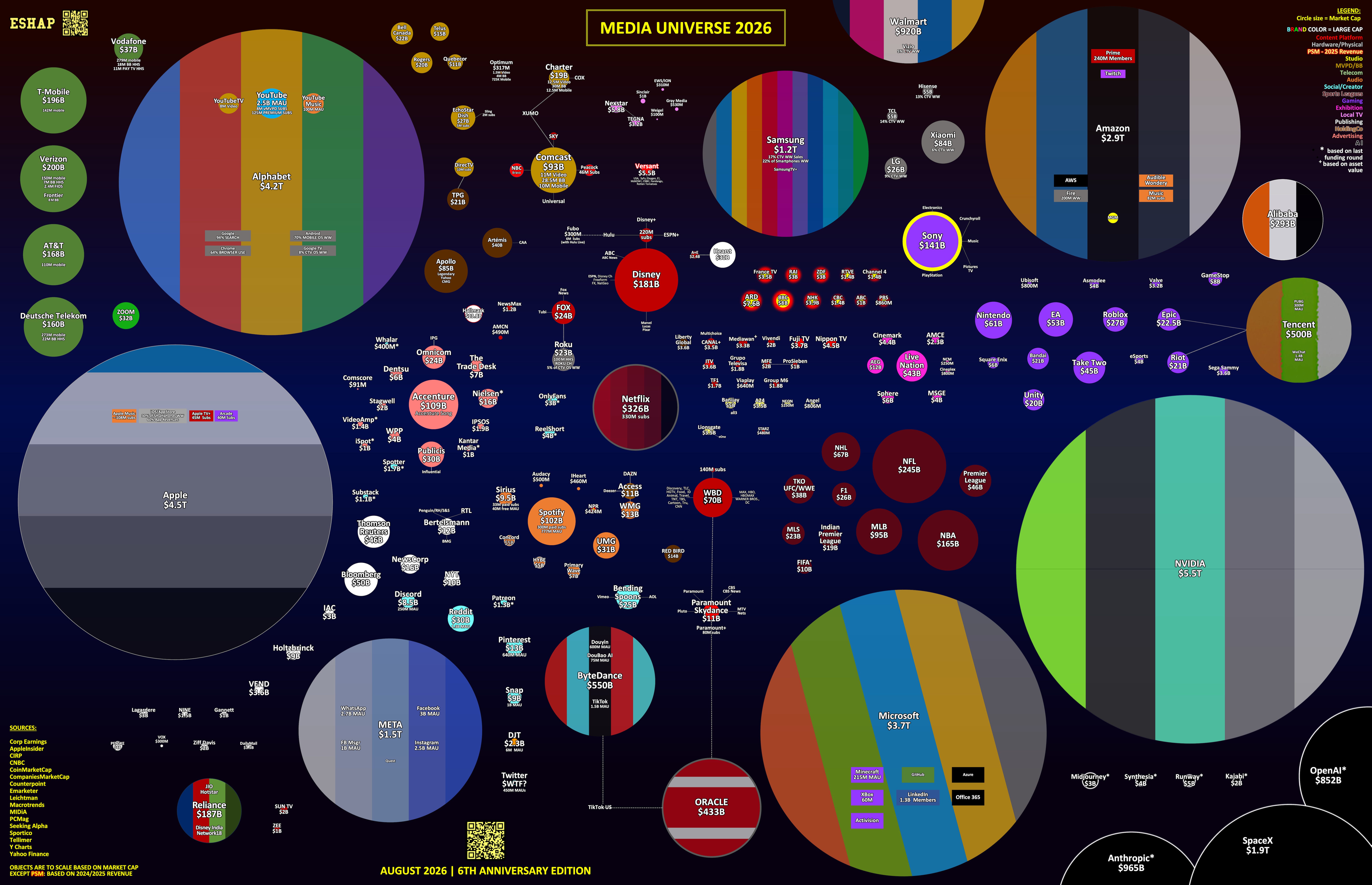
For context, here is the latest version of the current Media Universe Map for August 2026 - the very last version of this map before it is entirely reinvented.
But before we go there, let’s look back.
Six years ago, on August 15, 2020, I dropped my first Media Universe Map.

At that point, I’d been teaching at NYU for over a decade and was about to start a new class at Fordham. In my class presentations, I had been using a screen shot of an existing bubble chart portraying who owned what in Media, to which I had added dozens of layers of PowerPoint. It was presentationally sub-optimal. That summer, prepping for a new three-hour, weekly class at Fordham, I set out to chart my own map, from scratch.
In my career, I use teaching for three purposes: To share stuff I know with the next generation, to force myself to relearn my industry through their eyes, and to burnish my personal brand by being introduced as “a professor at NYU and Fordham.” My roles as an adjunct at NYU and Fordham Gabelli School of Business did all those things for me.
But those years teaching did something more for me. They were a forging process. The pressure for consistency and quality was high, not because the schools pay adjuncts well - they do not. But based on my own desire to not have students fall asleep in class, for them to show what they learned in their papers, and for them to rate me well on the year-end rate-your-professor forms. That’s why my PowerPoints are so bright and shiny. To keep sleepy students awake.
Over 18 years, I was fortunate to teach two generations - Millennials and Gen Z. The need and process to fill fourteen weeks per semester, twice a year, every year for 18 years, with fresh original thought about what’s happening in Media at that moment, forced me to build an information machine for myself - one by which I could gather and consume news and data about the industry and translate it, in relative real time, to a practically uninitiated audience, so it can easily be understood and recalled.
To make the process of updating the curricula - aka my lectures - less cumbersome at the start of each semester, eventually I began to update the metrics, charts, and trajectories of all the companies, platforms, trends, and audiences in my “master media universe presentation” all year round.
Whenever new studies or industry updates would come out from Nielsen, Comscore, or Leichtman, I’d build new infographics to have ready for whenever I needed them. Eventually, I started to wake up every morning (during school months and not) to spend an hour or two looking for new insights and stories to round out the knowledge base in my expanding curricula - understanding the data, building and storing hundreds of charts and graphs on my laptop, whether I wound up using them in a lecture or not.
Through this process, I found that the data, the information, the stories stuck inside my brain, not as a useless factoid, but rather as part of a chain - a new piece of a larger mosaic. Classroom discussions literally expanded the conversation, adding points of view, asking new questions, shining new light. This begged for more research.
The individual facts I collected each day in service of a deeper knowledge, laid end to end, began to show trajectories - they pointed my view toward increasingly knowable outcomes. This constant search turned into a continuous retraining. I started to see things differently. The teaching/learning process seeped into my “day job.”
In 2012, I wrote a HuffPo column about my NYU experience called TV: An Intervention. I used the data that I gathered all semester to show, despite wide conventional wisdom of the Hollywood Wise Men, that “cord cutting” was an actual thing. It seems hard to believe now, but this was, in fact, a controversial take in 2012. The essay clearly showed the trajectory of American TV usage, how and why Millennials and Gen Z (called Plurals back then) would not repeat the television lifestyles of previous generations, and that US Pay TV would lose 40% of its install base by 2030. I also included a final project by a group of my NYU students in which they proposed a streaming TV bundle that sounded a lot like what would eventually be Hulu Live and YouTube TV.
Five years later Hulu Live and YouTube TV launched. By 2025, 45% of the US Pay TV install base had disappeared.
That essay was part of a long series of instances where my continuous reeducation and my obsessive pursuit of better understanding, led me to the end of a trajectory, before my industry was ready to catch up. As attractive as getting to new ideas early may sound, standing alone, publicly, wrapped inside a new way of thinking, trying to tell everyone “what’s really happening” is often frustrating and isolating.
I left my job at IFC in 2012 because senior management refused to consider transforming the channel into a streaming service. I was fired from Participant because the owner wanted a TV channel and I wanted a cord-cutting platform. In 2015, I convinced Comcast to take The Office off Netflix for exclusivity on a new service I was starting, Seeso. Netflix offered Comcast $100 million to not do that. Comcast took the money. Because of course they did. That was my last “real job.” What might have happened if Comcast didn’t chicken out on The Office is my personal Schrödinger’s Cat.
In 2020, before Covid kicked in, before the map landed, as a thought experiment, I started publishing on LinkedIn every day.
As the world went bonkers in lockdown, I was going through a rough period with some terrible business partners. I was three years past getting shit-canned by Comcast. I needed to take fuller control of my career. So social publishing was an expansion of my personal brand, with a specific goal of generating more incoming opportunity.
With a “Captain’s Blog” at IFC, essays on HuffPost, teaching at University, and provocative public appearances as an outspoken exec (which drove corporate PR teams nuts), throughout my career, I had spent a good deal of attention on my personal brand. It’s how I developed a reputation in the industry as “a disrupter.” If you wanted someone to “shake things up,” I got the call. (Unfortunately, Big Media always thinks they want a disrupter, right up until they get one.)
But after 20 years of creating a brand connected to corporate titles, this was the first time I attempted to productize it solely for myself. It was also the first time in decades where I dedicated part of every day to writing - just for the sake of writing.
This allowed me to turn my daily discoveries into daily POV signposts that I shared with my community. Remember, this was Covid, so people desperately needed something to do. At first, reaction was limited to people I already knew. But as my signposts got more pointed, and my predictions got more bold, these daily posts turned into a daily utility. My community shared with their communities, and the audience for my dispatches grew.
As it turned out, a LOT of career media professionals were equally frustrated with the slogging rate of progress the industry was making toward the transformation it so obviously needed. But almost no one felt comfortable saying it aloud. Many lacked the full information to make the case. Many more felt intimidated and handcuffed by the “Yes-Man Big Media Corporate Industrial Complex” that had ejected me like a virus a few years earlier.
With a massive cache of shareable intelligence, a now habitual routine that continuously replenished my narrative, and a decade-plus of reputational brand value as a provocative bomb thrower, my daily missives found purchase far beyond my original network. I found that the more value I shipped to the world each day - without a specific expectation of return - the more value returned to me organically. The algorithm started pointing new people and new opportunities my way.
I did not know it at the time, but by the summer of 2020, I was in the process of transforming into a Creator - a term that didn’t even really exist yet. I was literally writing a new chapter for myself and my career.
Then I dropped that map.
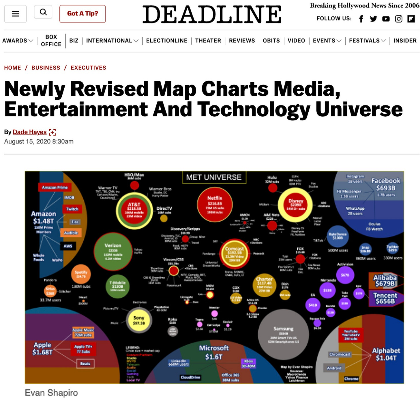
This one infographic was the culmination of a lifetime of work and imagination. It perfectly blended my constant investigation for new information, my use of PowerPoint as an art form, my love of teaching, and my historically under-capitalized superpower for motivating change - into a singular narrative.
It was the first time someone had put all the characters from the Media Universe in one scene. It was the clearest picture to date of what was actually happening in the Media business - Big Tech had already seized control, Big Media was losing it.
That story captured a LOT of attention. And it permanently changed the trajectory of my life… into someone who now trades on trajectories for a living.
Here is the Media Universe Map for August 2026 - the Sixth Anniversary Edition. This is my last map before I redraw it entirely.
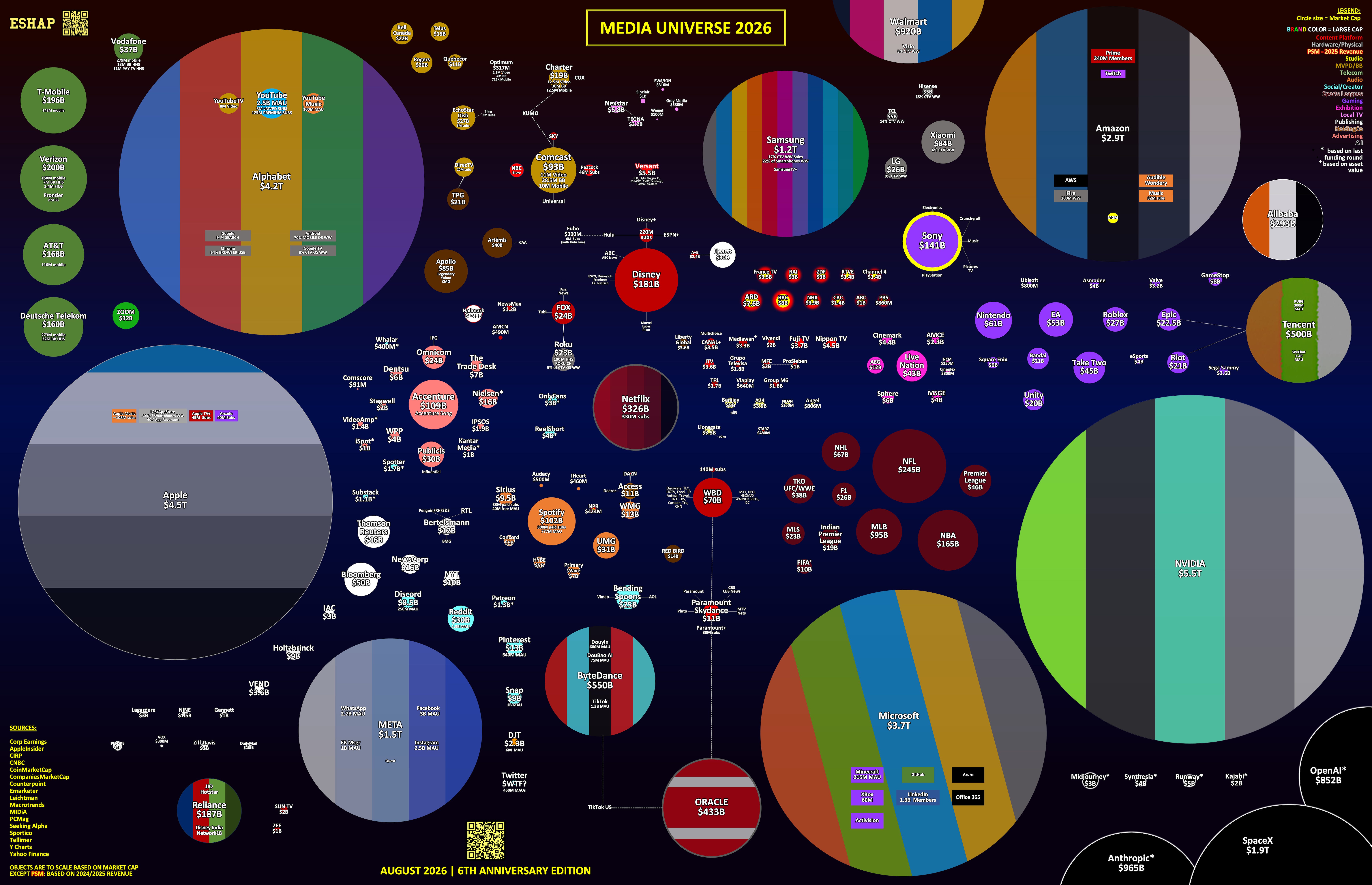
I have updated this map every month since August 2020. I’ve published more than 100 versions - all made with a palette of Excel and PowerPoint. This process has changed my brain. I see the world entirely differently since I started mapping the universe. Apparently the universe sees me differently too.
You can see maps from each of the last six years, here.
The changes to the map and universe these last six years are immense - following a trajectory the first map revealed. With each edition, the center of gravity has shifted further toward Big Tech. For perspective, at its last valuation, OpenAI, a company without a demonstrable business model, is now worth more than Netflix, WBD, Paramount, Disney, Fox, and Comcast, combined. For countless reasons beyond this map, the universe on this map is on the brink of its greatest change since I began mapping.
Which is why I am setting the map free.
This year, thanks to brilliant branding expert Lauren Zeinfeld, I realized that to unlock the real value of my Media Universe Map, I need to set it free. Each new version has reliably sparked discussion in our community. Many of the best improvements I’ve made have come from reader comments and DMs. However, until now, it’s been too much monologue not enough conversation.
This new worldview will allow you to drive the conversation - to double-click on individual companies, deep-dive into specific segments, to zoom out for new views, and look back across longer trajectories. Crucially, it will be a live platform, continuously updated and controlled by the user, revealing different things to each visitor, creating more dynamic conversation and value in the community.
Of all the discoveries the map has revealed, the second most valuable is this:
The process of search-and-learn, draw-and-redraw, conceive-and-reinvent is 1000% transferable. Wherever you want to go, whatever you want to achieve, whatever your superpower, if you build a mechanism to tackle your goals, incrementally, day-by-day, and hold yourself accountable for a specific and reasonable amount of growth each “semester” of your life, you will put yourself in a better place to find the change you need, at a pace you can control.
The most treasured byproduct of my cartography? By far: Community.
Opening the aperture of my mapping opened new worlds to my experience and introduced me to new people all over the planet. I’m so grateful for the enormous value you all bring me every day. I am really nervous about the changes we’re making and incredibly excited to share them and start a new conversation with you.
Cheers.
ESHAP
I was waiting for that step - interactive and drill-throughable! I love it - but please do not stop posting the snapshots. We still need your view on things we might miss while staring at the wrong moon. Thanks for everything!
Love this, Evan. The map itself is great, but the part that really stuck with me is the idea of building a system that forces you to keep learning.
There’s something powerful about researching, writing and putting a point of view out there consistently. Over time, you’re not just building an audience - you’re sharpening how you see the industry.
And the shift toward Big Tech over those six years is pretty remarkable. The map started as a way to understand the media business, but increasingly it shows how much of the media business now sits inside a much bigger technology ecosystem.
Turning the map from something people look at into something they can actually explore feels like a pretty natural next chapter.